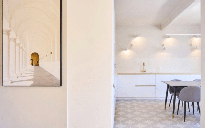
A journey from the work to the lived space
Not all exhibitions speak of movements or styles. Some simply force us to look at them differently.
A few weeks ago we visited The Autonomy of Color, at the Juan March Foundation in Madrid. An exhibition that does not review chronologies or put names in order. It puts something more essential on the table: color not as a tool, but as a presence
Color as a body, not as a resource
Walking through the exhibition, we feel a certainty: these artists do not paint forms. They do not seek to emote or represent. They allow color to be. Let it exist without having to justify its place.
Sometimes it appears as a visual outburst, sometimes as silence. It can be structure or emptiness. It can weigh or float. But it always has something in common: its autonomy.
Klein forces us to surrender to the blue. Kapoor drags us into the depths of pigment. Riley unsettles our gaze. They all share the same impulse: to turn color into event, not decoration.
¿What do we learn from this as interior designers?
For those of us who design spaces, this exhibition not only inspires: it demands more responsibility. Color is not there to please. It is not just another pantone in the catalog. It is part of the space, with the ability to calm, contain, tense, accompany or suspend time.
That is why color in a project is not imposed: it is listened to. It is decided in dialogue with the light, with the place, with the people. It is integrated from perception, not from habit. Because every tone communicates, even when it seems not to.
It is not necessary to cover everything. Sometimes, a single well-thought-out chromatic decision transforms the entire atmosphere. A plane treated with precision. A texture that balances. A tone that does not compete, but accompanies.
As in art, in interior design color does not have to explain anything to be essential. It just needs attention, time and a look.


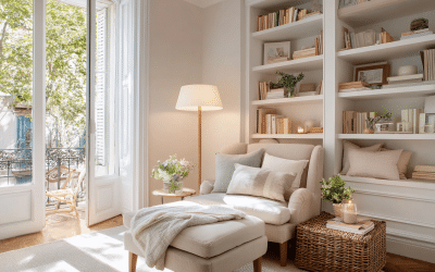
At Sezam Studio, we understand it this way: color does not dress the space, it gives it meaning. It does not beautify it: it orders it emotionally. It does not fill it: it makes it breathe.
The challenge is to use it with rigor, sensitivity and purpose. Like someone who chooses a word in a poem. Like someone who does not want to say more than necessary, but says it with truth.
¿Quieres ver cómo aplicamos el color en nuestros proyectos?
Descubre espacios donde cada tono está pensado para acompañar. See projects.